Brand Project 02 Overview
Brand Project 02 explores the junction of artisanal craft and digital precision. We aimed to build a visual presence that balances heritage with forward-thinking innovation.
브랜드 프로젝트 02는 수공예의 가치와 디지털의 정밀함이 만나는 지점을 탐구합니다. 우리는 전통과 혁신적인 비전이 조화를 이루는 시각적 존재감을 구축하는 것을 목표로 삼았습니다.

The Challenge & Solution / 도전과 해결 전략
Strategic Hurdles / 전략적 과제
The primary challenge was modernizing a heritage print brand for the digital age without losing its tactile soul. We needed to create a system that felt both high-tech and hand-crafted.
핵심 과제는 브랜드 고유의 아날로그적 감성을 유지하면서도, 디지털 시대에 맞는 현대적인 브랜드로 재정의하는 것이었습니다. 하이테크와 핸드크래프트의 조화를 이루는 시스템 구축이 필요했습니다.
Creative Synthesis / 창의적 해결책
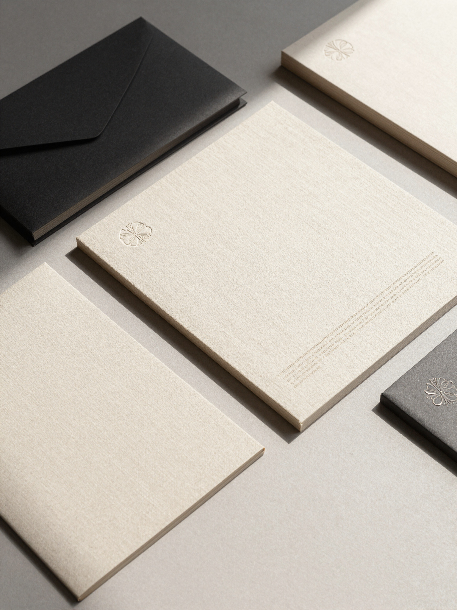
We developed a 'Tactile Digital' identity system, using high-contrast typography and digital-native layouts paired with organic linen textures and premium paper stocks.
우리는 '촉각적 디지털' 아이덴티티 시스템을 개발했습니다. 고대비 타이포그래피와 디지털 기반 레이아웃을 유기적인 린넨 텍스처 및 고급 지류와 결합하여 시각적 깊이를 더했습니다.
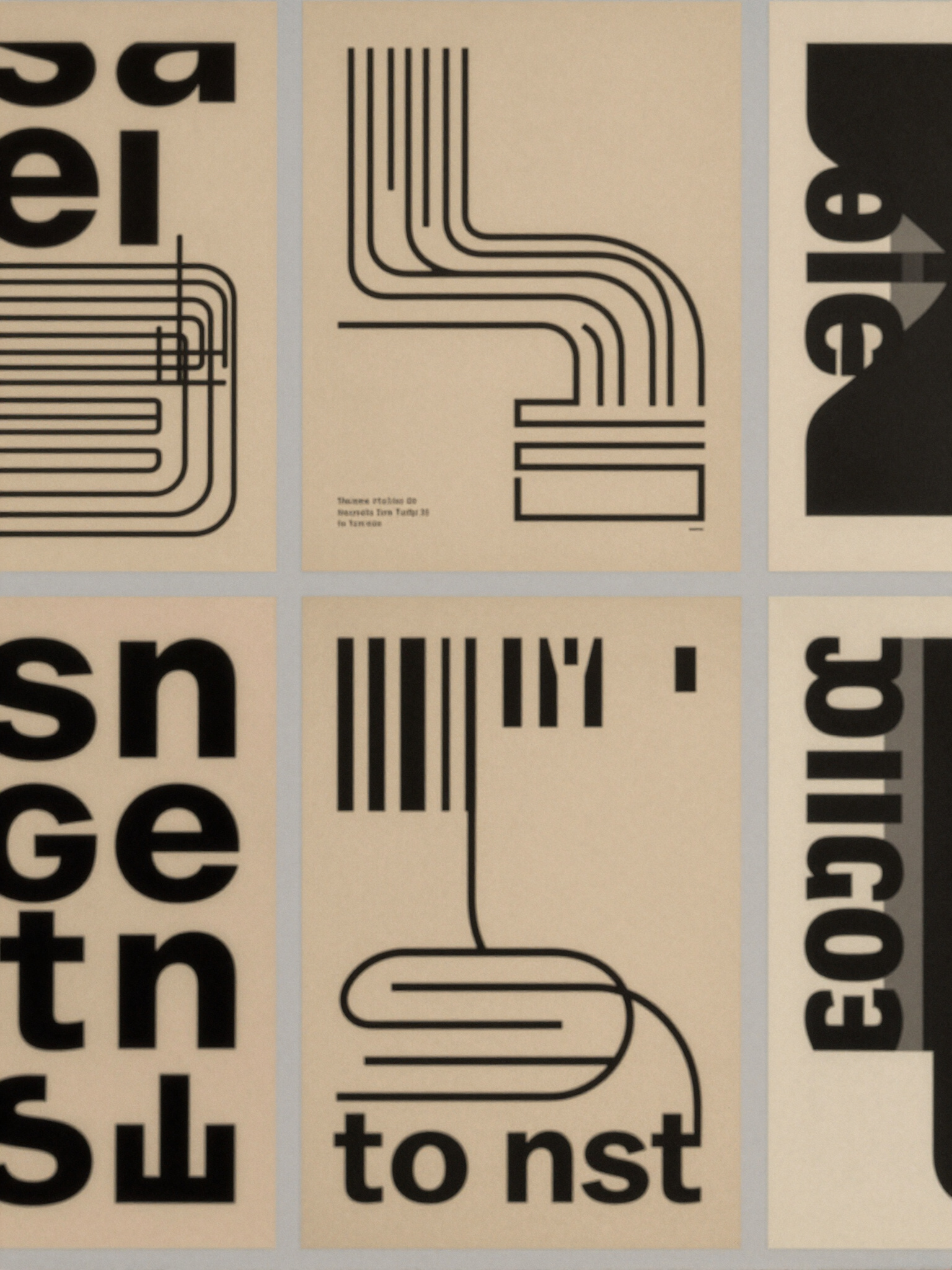
Brand Deliverables / 브랜드 작업물 갤러리
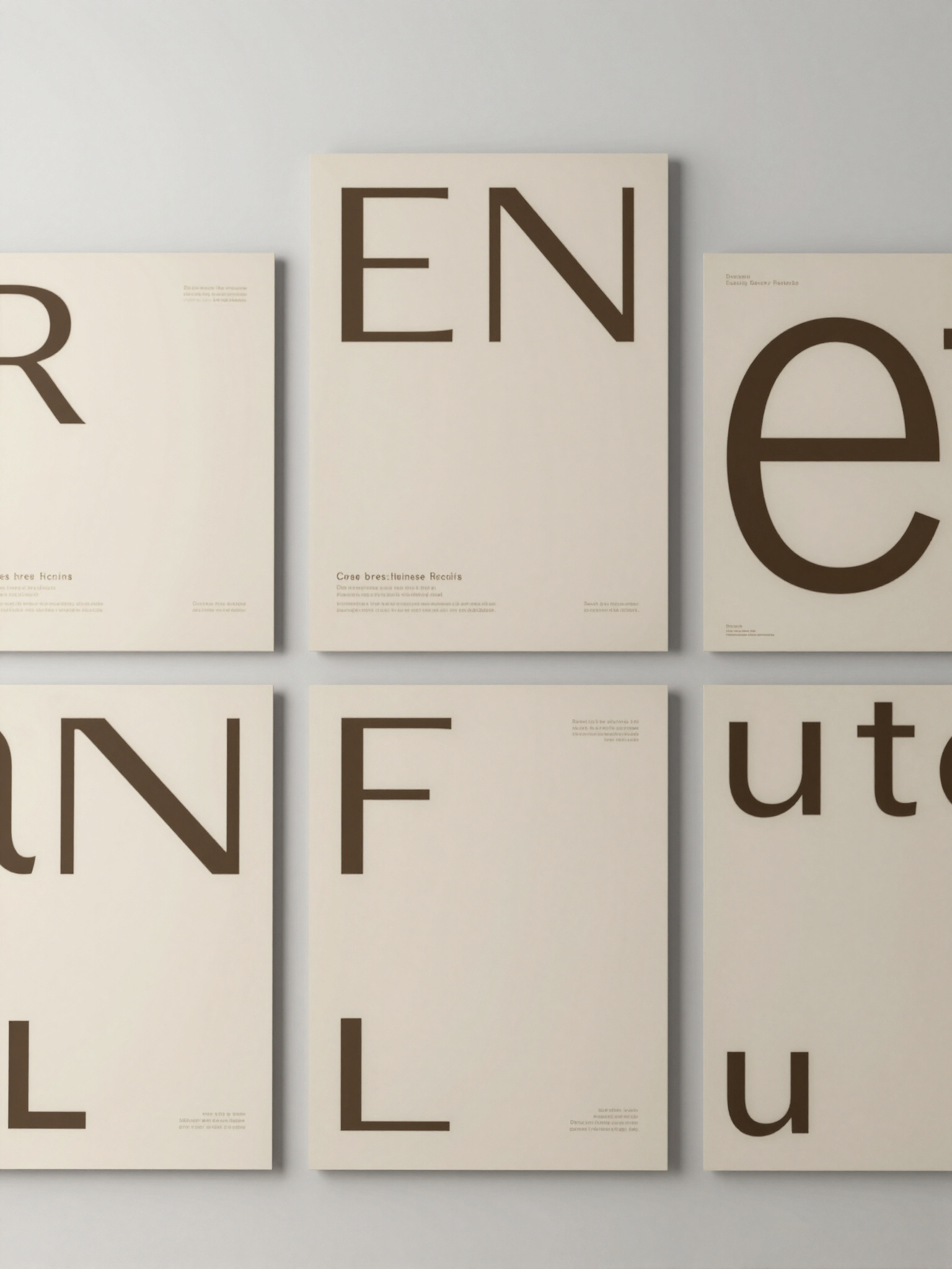
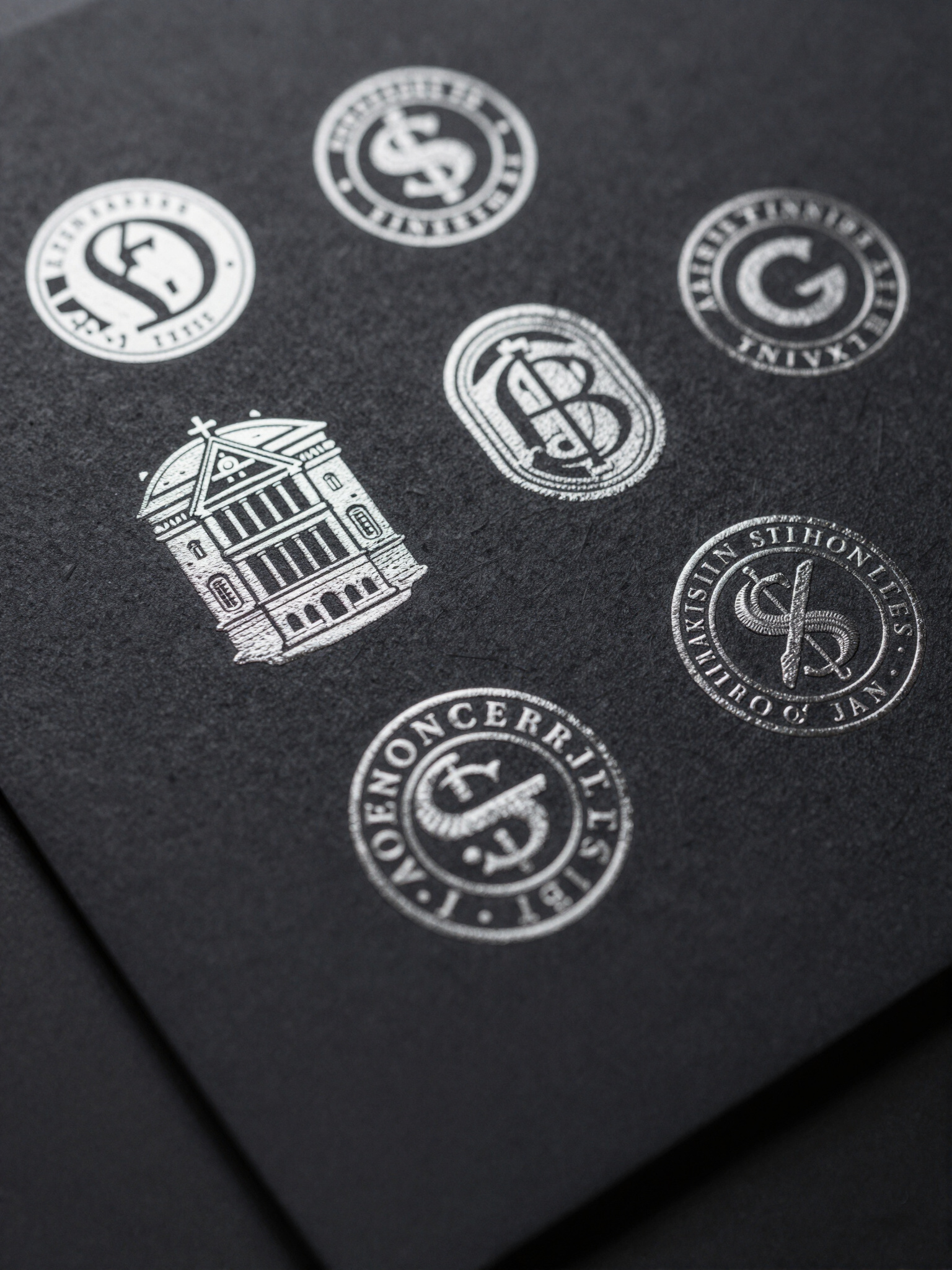
A curated showcase of print textures, typography, and graphic assets. / 물성이 느껴지는 지류와 타이포그래피, 그래픽 자산의 조화를 보여주는 큐레이션입니다.



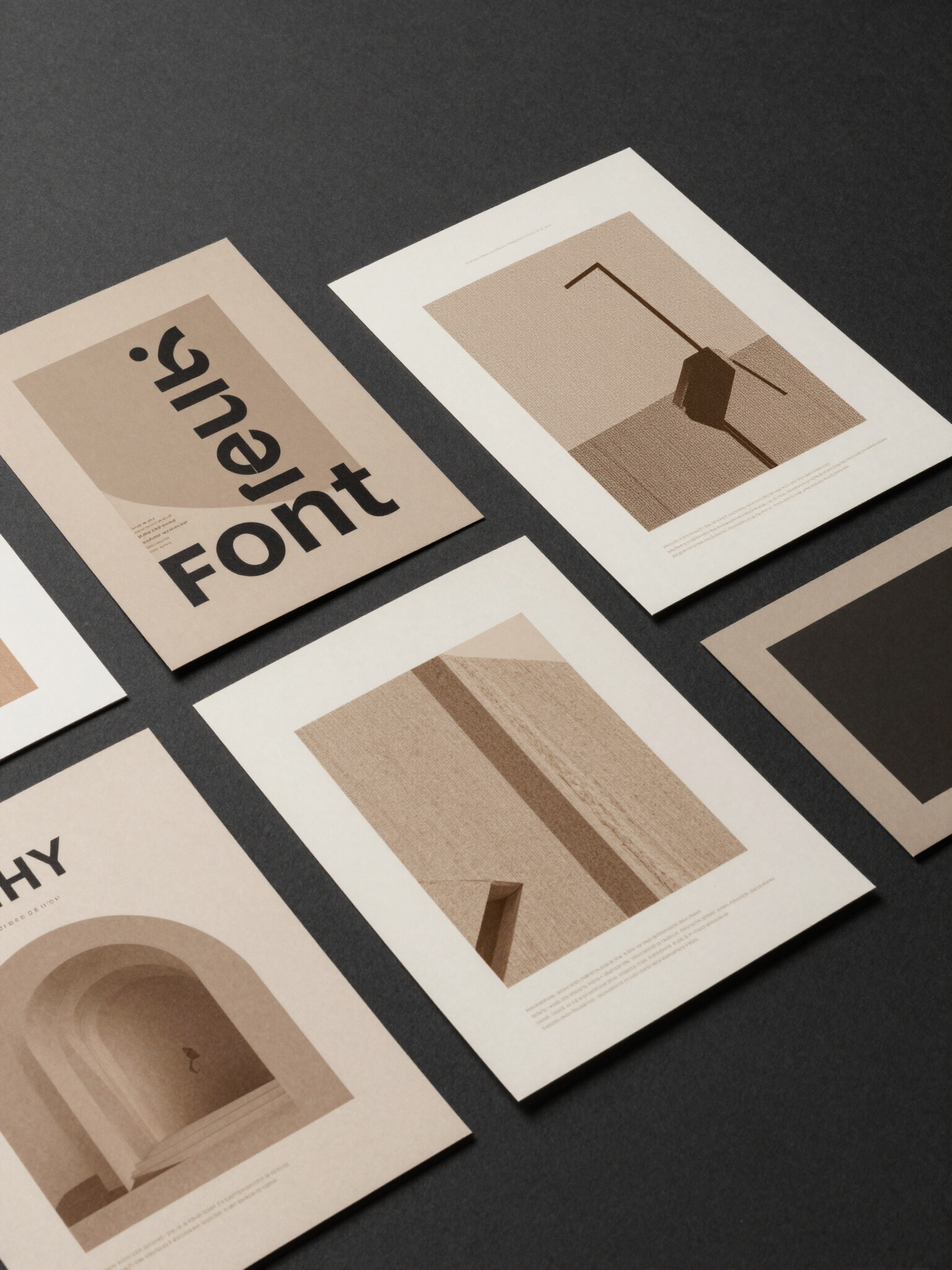
Typography / 타이포그래피
Aether for headlines conveys tactical precision, while Neue Haas Unica Pro handles secondary communication with sleek clarity.
헤드라인을 위한 Aether는 전술적 정밀함을 전달하며, Neue Haas Unica Pro는 매끄러운 명료함으로 보조 커뮤니케이션을 담당합니다.
Aa Zz 02
Neue Haas Unica Pro Regular
Brand Palette / 브랜드 컬러 팔레트
A sophisticated mix of warm neutrals and high-contrast charcoal evokes an artisanal yet architectural mood.
따뜻한 중채도 색상과 고대비 차콜의 정교한 조합은 장인정신과 건축학적 분위기를 자아냅니다.
Logo Construction / 로고 구조
The minimalist wordmark is balanced with tactical spacing to maintain legibility across various scales.
미니멀한 워드마크는 다양한 크기에서도 가독성을 유지하도록 전략적 여백으로 균형을 맞췄습니다.


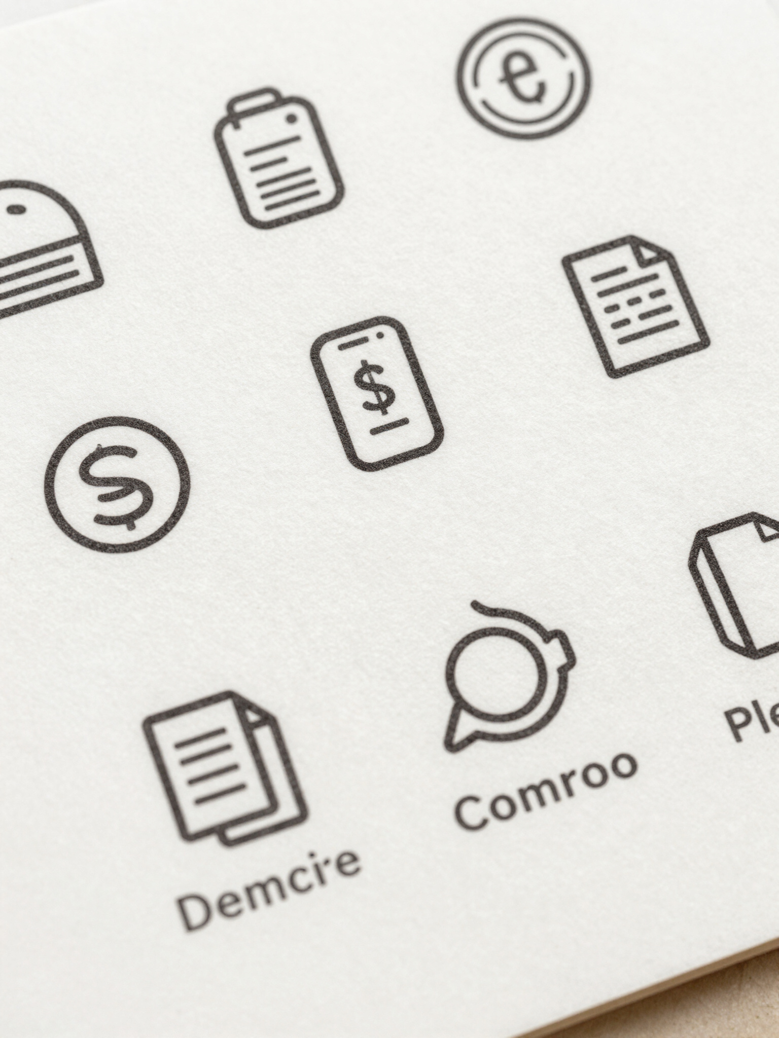
Visual Identity System / 비주얼 아이덴티티 시스템
Scalable graphic systems designed for physical impact and architectural consistency. / 물리적 영향력과 건축학적 일관성을 고려하여 설계된 확장 가능한 그래픽 시스템입니다.